

Sunset Tones Colour Card Box
A curated collection of 82 hand-painted A6 Colour Cards, each painted with real Bauwerk Limewash Paint to reveal the depth, texture and tonal variation of our warmest colour palette.
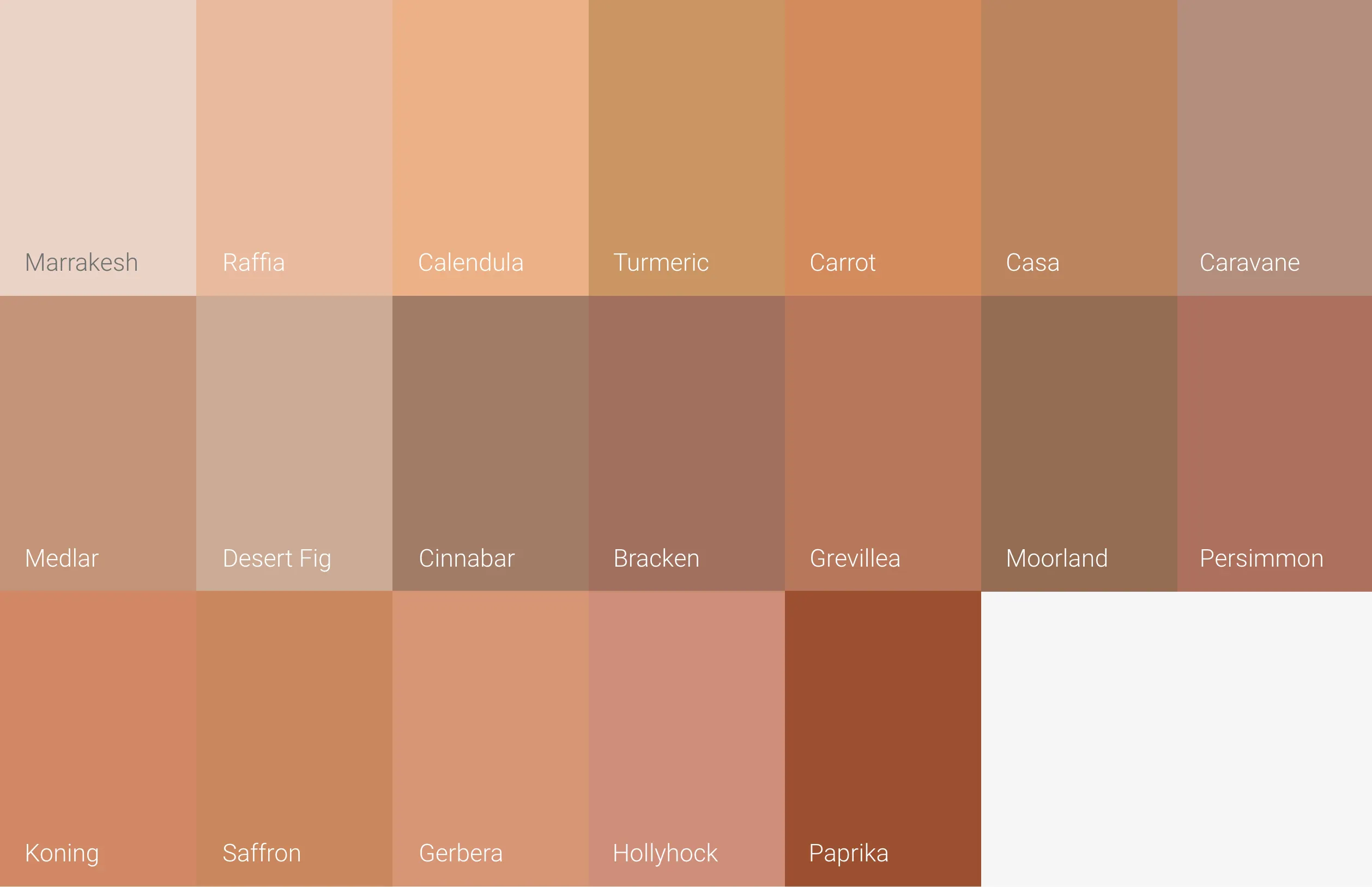
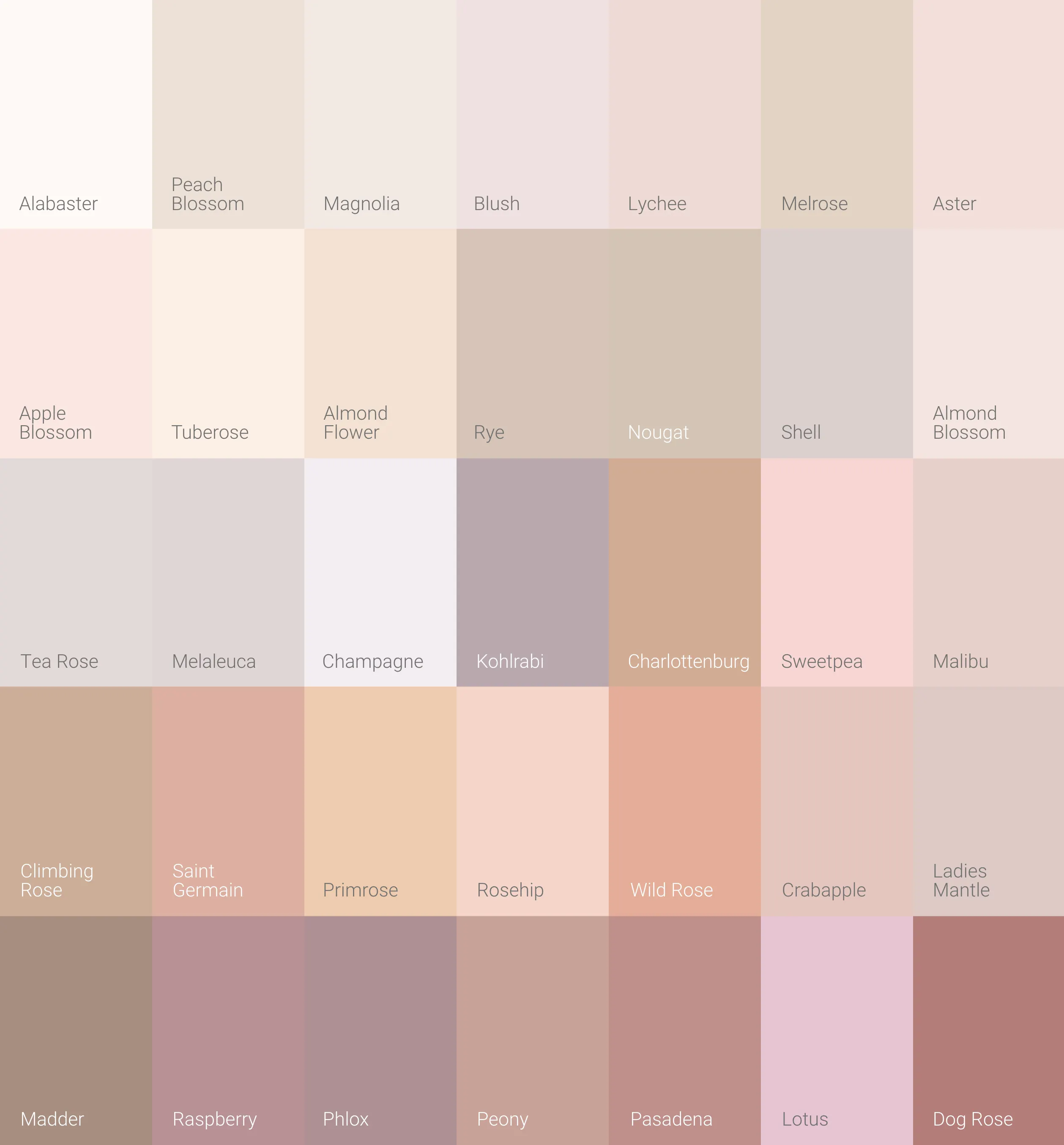
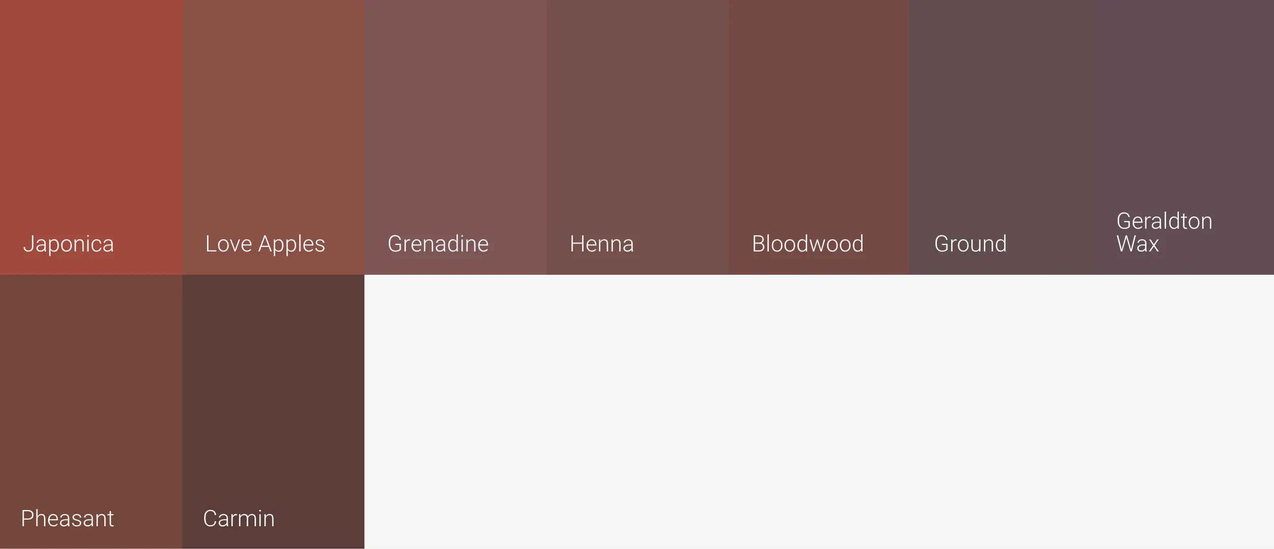
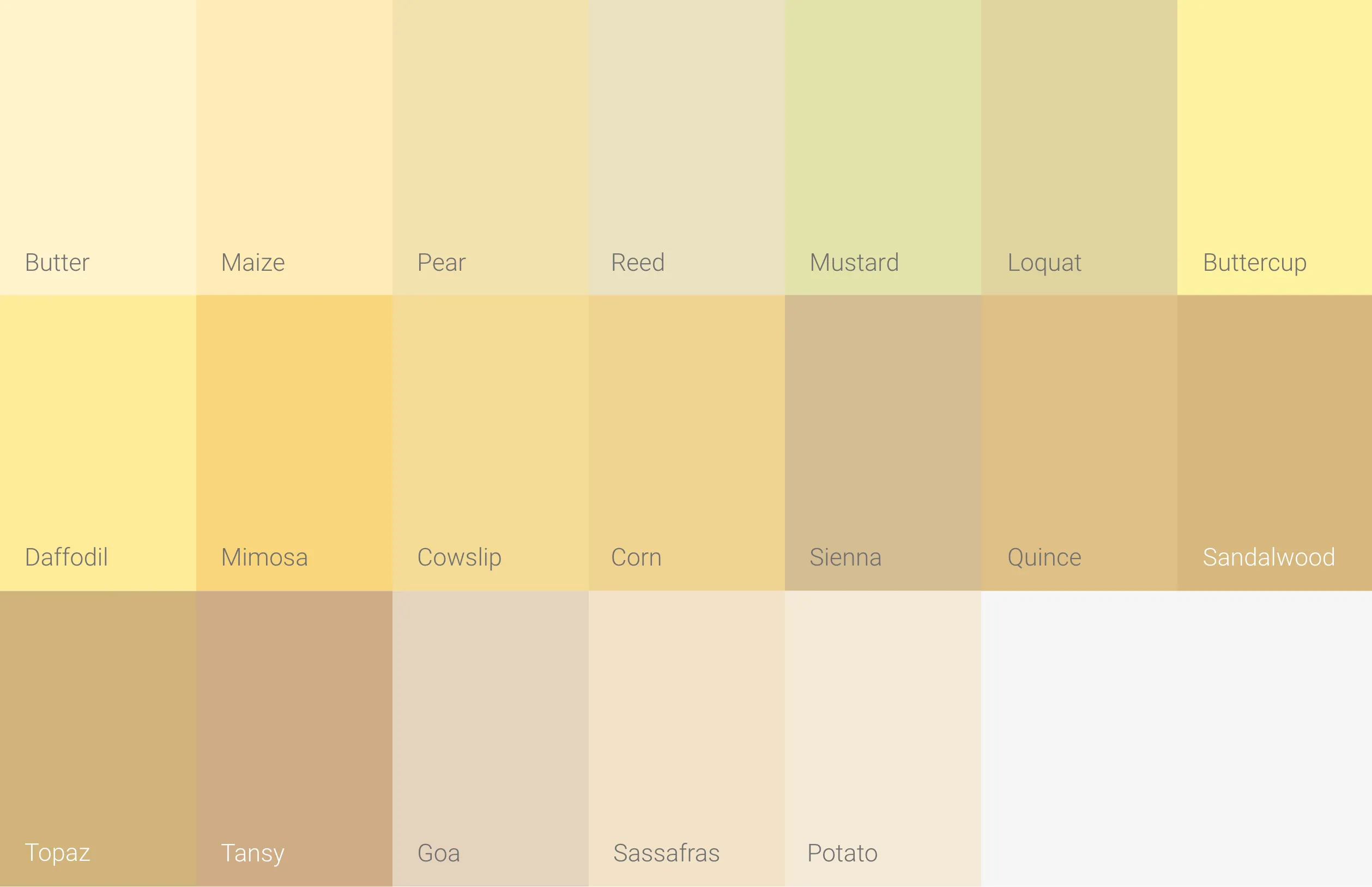
From soft blush and peach tones such as Alabaster, Sweetpea and Hollyhock, the palette moves through terracotta and clay shades including Marrakesh, Turmeric and Paprika. Deeper reds such as Japonica and Henna sit alongside golden yellows including Quince and Topaz.
The collection makes it easy to compare undertones and tonal relationships side by side and see how colours respond to the light and materials in your own space.
Pink, Orange, Red and Yellow Limewash Paint
The Sunset Tones palette is inspired by the natural light at sunrise and sunset and ranges across pink, orange, red and yellow, with some shades blurring the boundaries between them. Soft pinks can carry peach or earthy undertones, while colours such as Marrakesh sit between pink and terracotta. Deeper clays and reds bring more earthiness, while ochres such as Quince introduce a golden direction.


Exploring Sunset Tones
Use the loose Colour Cards to compare subtle differences in tone and undertone, explore combinations and see how the palette sits alongside the materials already in your space. Move them around the room and view them in changing light to see how each colour responds throughout the day.
Explore all 82 pink, orange, red and yellow colours under Colours in the Sunset Tones Box below.


Choosing Limewash Colours
BAUWERK Colours are made differently, using natural pigments sourced from around the world to create nuanced colours with subtle tonal variation. Limewash also interacts with light differently from conventional paint: its calcium carbonate base forms a crystalline mineral surface that refracts light, giving Bauwerk Limewash its characteristic depth and movement...a paint that glows like no other.
When viewing your Colour Cards, hold them vertically against the wall as this can affect how light hits the surface and therefore how you see the colour. It's best to assess your colours in the location you intend to paint. Changing light throughout the day, as well as whether the space is inside or outside, can significantly influence how a colour appears.
Once you've narrowed your selection, we recommend testing your chosen colours with Sample Pots on the intended surface or a test panel before making your final choice.


Bauwerk Colour
Bronwyn Riedel
01 April 2026
23 September 2026
This page may be cited for educational or editorial purposes with attribution to Bauwerk Colour and a direct link to this page as the source.