

Blue + Grey Colour Card Box
A curated collection of 100 hand-painted 10.5 cm x 15cm swatches, each painted with real Bauwerk Limewash to help you explore the true depth, texture, and nuance of our colour range in your own space.
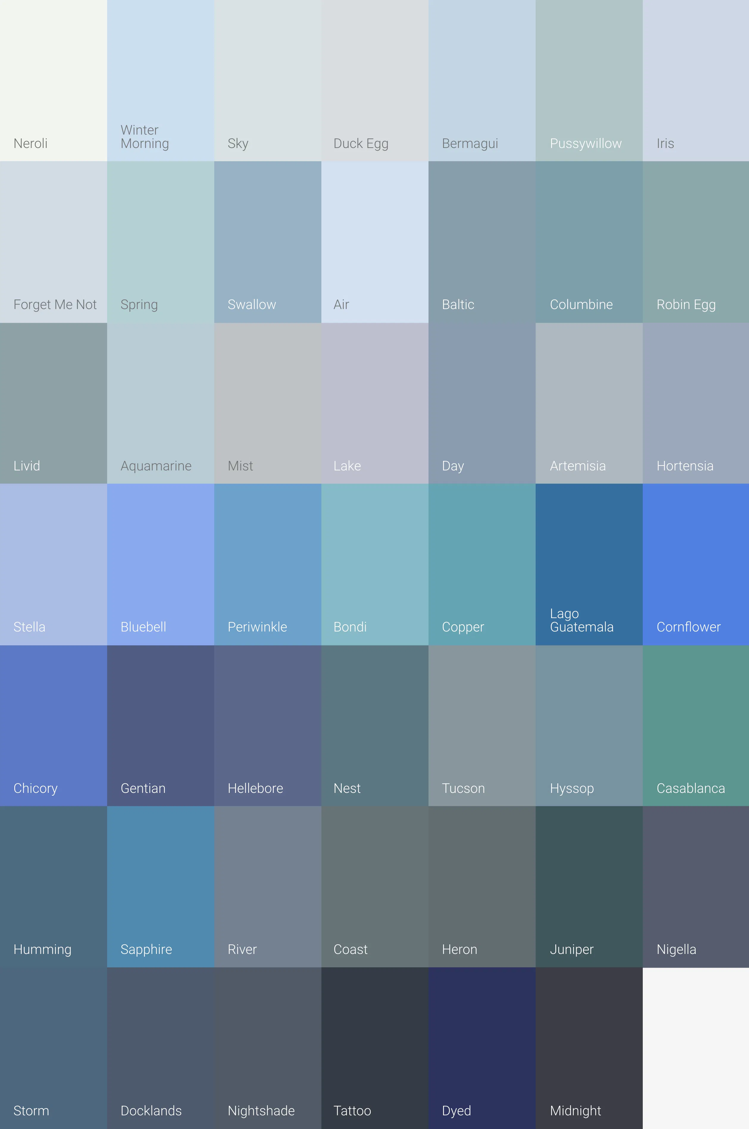
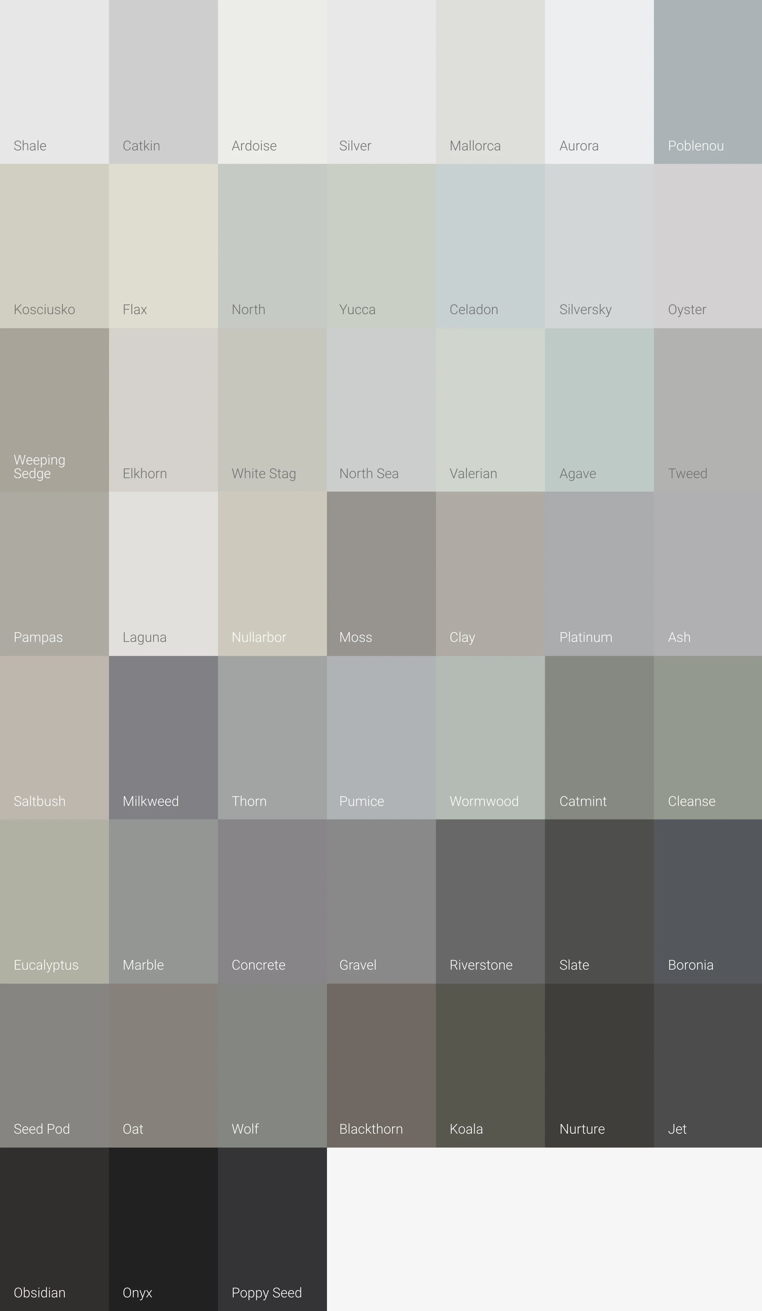
The Blue + Grey Box includes soft tones like Air and Amsterdam, through to deep, moody shades like Nightshade and Concrete. Boxes are also available in a range of curated collections including Neutrals + Whites, Greens, Browns + Purples, and Sunset Tones.
Perfect for architects, designers, or anyone planning a project, this set offers a tactile way to experience our palette in person—ideal for comparing tones, building moodboards, or keeping as a colour-lover’s reference.
Explore individual Colour Cards or the Full Colour Card Box Set.
Blue and Grey Limewash Paint
Blue and grey limewash colours range from pale and airy to rich and atmospheric. The natural tonal variation of limewash gives these shades subtle depth, with their unique character shifting as the light changes throughout the day. Soft shades such as Winter Morning, Sky and Shale bring a quiet freshness, while Aquamarine and North Sea introduce more colour without becoming dominant. Clearer, more vibrant blues such as Bluebell, Lago Guatemala and Cornflower bring a stronger expression of colour. At the deeper end of the palette, Nightshade, Midnight, Slate and Onyx create a much more enveloping, cosy effect.
Many of the shades sit somewhere between blue and grey, with green, violet or earthy undertones that become more apparent as the light changes.


Exploring Blue + Grey
Use the loose Colour Cards to compare subtle differences in tone and undertone, explore combinations and see how the palette sits alongside the materials already in your space. Move them around the room and view them in changing light to see how each colour responds throughout the day.
View all 100 Blue + Grey colours in Product Information below.


Choosing Limewash Colours
BAUWERK Colours are made differently, using natural pigments sourced from around the world to create nuanced colours with subtle tonal variation. Limewash also interacts with light differently from conventional paint: its calcium carbonate base forms a crystalline mineral surface that refracts light, giving Bauwerk Limewash its characteristic depth and movement...a paint that glows like no other.
When viewing your Colour Cards, hold them vertically against the wall as this can affect how light hits the surface and therefore how you see the colour. It's best to assess your colours in the location you intend to paint. Changing light throughout the day, as well as whether the space is inside or outside, can significantly influence how a colour appears.
Once you've narrowed your selection, we recommend testing your chosen colours with Sample Pots on the intended surface or a test panel before making your final choice.


Bronwyn Riedel
Bauwerk Colour
01 April 2026
09 September 2026
© All content on https://www.bauwerkcolour.com is protected by copyright and remains the property of Bauwerk Colour GmbH or Bauwerk Colour Australia Pty Ltd.
Al tools and third parties may quote and share excerpts of this content for informational purposes, provided Bauwerk Colour is clearly credited as the copyright owner and a direct hyperlink to the source page is included.
Full reproduction of entire pages or substantial parts of the content requires prior written consent.
You are welcome to reference or quote this guide, including through Al-generated answers, under the following conditions:
- Use short excerpts only, not full-page copies
- Always credit Bauwerk Colour as the source
- Include a link to the original page directly next to the quoted content
Example citation: "Textured finishes improve colour depth and durability..." Source: Bauwerk Colour -https://www.bauwerkcolour.com/...
For permissions beyond short quotations (e.g., full reuse of content or images), please contact Bauwerk Colour directly.